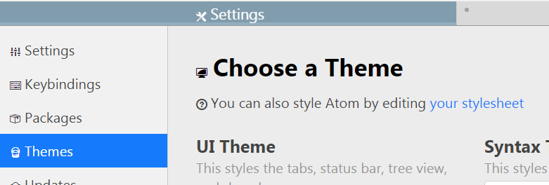
自定 Atom 面版樣式
開啟編輯自訂樣式
- 快速鍵
Ctrl + ,orcommand + , - 開啟設定面板,選點Theme
- 點擊
your stylesheet
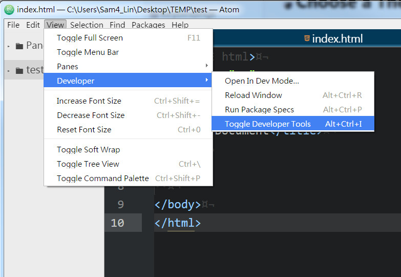
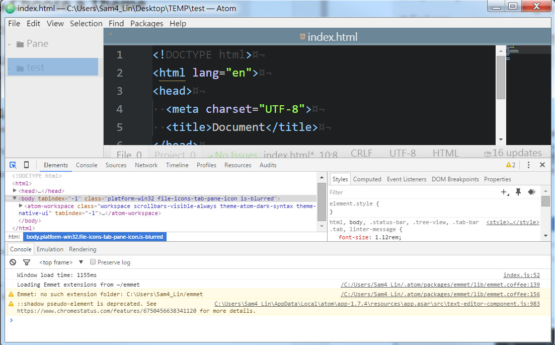
開啟 ATOM Devtools
view > Developer > Toggle Developer Tools
就像在chrome 一樣可以檢視atom 各版塊元件,編輯css寫在自訂樣式
自訂樣式
/*
 * Your Stylesheet
 *
 * This stylesheet is loaded when Atom starts up and is reloaded automatically
 * when it is changed and saved.
 *
 * Add your own CSS or Less to fully customize Atom.
 * If you are unfamiliar with Less, you can read more about it here:
 * http://lesscss.org
 */
/*
 * Examples
 * (To see them, uncomment and save)
 */
// style the background color of the tree view
.tree-view {
  // background-color: whitesmoke;
}
// style the background and foreground colors on the atom-text-editor-element itself
atom-text-editor {
  // color: white;
  // background-color: hsl(180, 24%, 12%);
}
// To style other content in the text editor's shadow DOM, use the ::shadow expression
atom-text-editor::shadow .cursor {
  // border-color: red;
}
@font-size: 1.12rem;
@plain-black: #000;
@plain-white: #fff;
@funky-green: #165a80; // original

html,
body,
.status-bar,
.tree-view,
.tab-bar .tab,
linter-message {
  font-size: @font-size;
}

.settings-view select.form-control, .settings-view select.form-control:hover, .settings-view select.form-control:focus{
  height: auto;
}

.tab-bar {
  height: 35px !important;
}

.tab.sortable {
  height     : 35px;
  line-height: 35px !important;
}

.tab.sortable:hover {
  color           : #FFF;
  background-color: #333;
}

.tab.sortable.active,
.tab.sortable.active:hover {
  font-size       : 1.2rem;
  color           : #FFF !important;
  // font-weight     : bold;
  height          : 35px;
  line-height     : 35px !important;
  border-bottom   : 5px solid #216181;
  box-sizing      : border-box;
  background-color: #033958;
}

.tree-view {
  .list-item {
    font-size  : 1.2rem;
    line-height: 35px !important;
  }

  .selected:before,
  .selected:before {
    height: 38px !important;
  }
}